MilVets Logo and Symbolism

Task:
Develop a visual logo that is unique to MilVets, and represents a diverse membership and the values set forward in the MilVets About Us statement. The logo must have a simple reproducible design and must not imply DoD affiliation.
Primary meaning:
The Olive Wreath symbolizes our greater purpose of Peace and the corporeal ring symbolizes our life transition to ‘Civilization’. The Spearhead symbolizes our military background. The scarring on the Spearhead symbolizes the war experience in the group.
Secondary meaning:
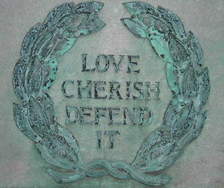
Olive Wreath - Columbia affiliation: It is the same olive wreath as in the inscription beneath the American flag on Low Plaza, donated by the Grand Army of the Republic (see here and here for background). An olive wreath is also below the Columbia flag on Low Plaza. Therefore, it symbolizes Columbia and Columbia military heritage, and to an extent, our American affiliation. An olive wreath can also symbolize nobility.

Spearhead – Warrior Ethos: Our military is commonly referred to as the "tip of the spear", which is appropriate. At the same time, the spearhead is not a branch nor even U.S. Military specific symbol - it is an ancient symbol of the Warrior Ethos. MilVets is less about defining ourselves by the uniforms we wore or still wear. Our group is more about the common experiences we each internalize in our own way and the values we choose to carry forward from our military histories.
The Spearhead points up for eternal vigilance. Its placement at the center of the Olive Wreath symbolizes the living spirit of the nation’s warrior-defenders in the heart of MilVets.
Aesthetic:
Clean, simple, good balance and symmetry, unmistakable up-down orientation, mostly closed and self-contained design. The primary meaning, if not the secondary meanings, should be obvious. The design should be easily reproducible as a logo on a banner, stationery, apparel, etc..
Concept and symbolism by Eric Chen. Final design by Mike Nicholas with final detailing by Luke Stalcup. Todd Murphy contributed artistic suggestions. Spring 2006 - Oscar Escano, President.
0 Comments:
Post a Comment
<< Main